Week One seems forever away. We spoke of the ubiquity of digital design. We viewed samples of commercial projects. We practiced logotypes and experimented with fonts on Illustrator. The images and concepts float vaguely through my mental processors. I’m eager for today’s class to firmly cement the applications of graphical expressions within my wandering inquisitions.


These images inspired me because they are all a result of creative design. The Hard Rock Cafe doesn’t simply employ a musical instrument as signage; the guitar is upside-down, which catches the eye and generates a force of subconscious tension. Illuminated or not, the sign is hard to miss.
The Snapchat ghost was on a billboard along Hwy 99 for a time. My boyfriend and I would drive past it each morning and wonder what the heck it was supposed to be. It looked like the outline of a Shrek head mask. It wasn’t until I saw the image on the backside of a Starbucks cup that I garnered enough insight to ask my teenage daughter about the image. Personally, I think a pair a small black eyes would assist the portrayal of a ghost. Whoever made a ghost costume out of a sheet without first cutting out eyeball holes?
Vogue is included here because it’s an obvious magazine cover. What struck me about this particular image is the thought process behind it. Someone was in charge of choosing font size and color as well as placement of the words in addition to which words were chosen to highlight the magazine’s content. I was impressed by all of the decision making that results in each individual cover, all of which compete for the attention of the distracted, over-stimulated hurried consumer passing the magazine counter.
What is the deal with the Starbucks logo anyway? It’s weird, simplistic, and makes no logical sense whatsoever. And yet, it’s probably the most recognizable logo in history. The headquarters building only displays a very small part of the logo without anyone questioning what company it belongs to. There are a myriad of variations ranging from sarcastic manipulations to beautiful artistic expansions, and every single one of them is discernibly connected to the original.
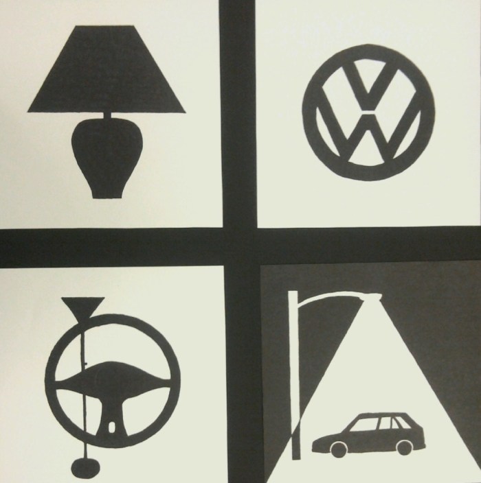
This photo is for a mock advertisement I drew. It uses a known design within the framework of a new context. No one needs to guess which type of car is presented here. The juxtaposition of black and white images is clean and clear. The alteration of positive and negative space adds interested. The bold pictures capture the viewer’s attention. It tells a story without saying a word. Graphic design is about generating emotions and connecting a message, or a brand, within the neurology of the viewer.
