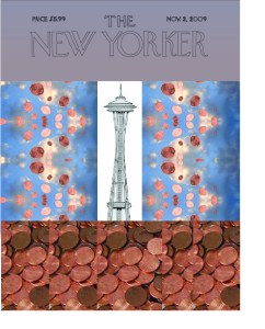
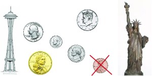
There were a couple of constructive comments regarding our cover. One suggestion was to add a picture of The Statue of Liberty or the Empire Sate Building along with the Space Needle. I dismissed that idea because the actual prior covers containing the St. Louis Arch or the Eiffel Tower both contained a single iconic landmark. I also thought it would make the cover cluttered and/or confusing.
The other comment was about how the pennies at the bottom were a bit overpowering. I agreed with this assessment and made a correction accordingly. The gray at the top seemed too drab in contrast with the brightly shining pennies. Therefore, I made the top and bottom sections clouded and simplified. This suggestion was much more useful.
There was also a comment about the resolution of the picture we had in this illustration. It was my favorite representation I found on Google Images,though. Instead of replacing it, I decided to clean it up a bit. I removed the background from the image, shrunk it down to prevent aliasing, and spread out the illustration to make it more linear so it would merely accent the top of the front page.
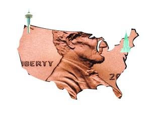
The final comments were regarding the illustration Topher created. Everyone mentioned that the illustration ought to show more of Lincoln’s face, that his head ought to be centered within the outline of the United States. We both agreed, and he re-positioned the clipping mask. We also discussed the placement of the illustration within the layout and concluded that, because Lincoln is facing to the right, we would position the illustration in the bottom-left corner of the second page in our spread.
Overall, I’m exceptionally pleased with the alterations we were able to make on our magazine cover assignment due to the feedback we received from fellow students. They’re all things we might have thought to change on our own, but we also might not have noticed the same observations made by others. A little objective critique can go a long way.
