Library Visit

floor

The typography plated floorboards are an inventive way of including multi-lingual aspects into the design of the building in the section housing multiple language texts.

movie

The DVD selection at this library is immense and diverse. It’s also the section I personally spend the most time in as checking one movie out from the library every few weeks is the only source of entertainment I avail myself to anymore.

collection

I asked about the Northwest Art Collection while getting let into one of the piano practice rooms, and this box of articles and newspaper clippings is what was produced for me. It didn’t seem like what the instructor had in mind for us to discover, though.

screen

So, I took a photo of the Northwest Screen also. This beautiful piece of artwork was hidden away one the first floor under the escalators in an otherwise empty, basically wasted space. Personally, I thought this area ought to simply be closed off and used for storage.

piano

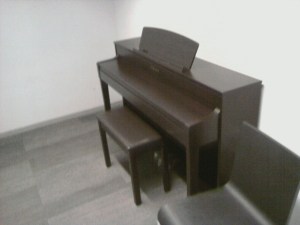
Not exactly what I would expect to find at a library, but incorporating a place to make music is a nice touch.

view

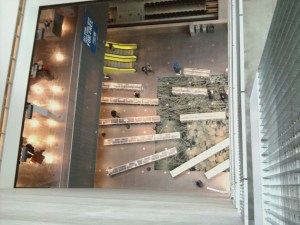
Even just looking at this picture makes me dizzy. I’m surprised the overlook area isn’t more tightly secure. Seems like a tempting place for someone wanting to learn how to fly.

book

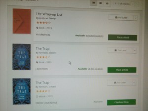
There was no book “The Wikkeling” in the card catalog. The only books by Steven Arntson were “The Wrap-up List” and “The Trap.”

map

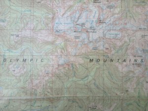
Cartography has never been my favorite. It’s good to know the map room exists, though, in case I ever need to resource it for some obscure reason, like a classroom assignment or something.

directory

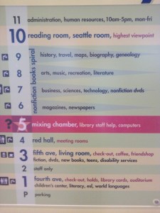
The Directories are bold, well-lit, easy to read, and easy to follow. However, if you’re smart and physically able, you’ll take the escalators and stairs instead of the elevator, much faster that way.

four

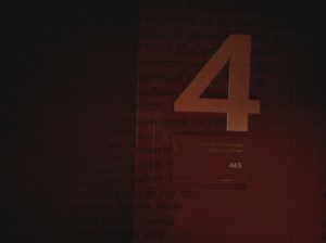
The immersion of red made me feel like I was trapped in an ’80’s horror movie. I don’t know what demographic this design choice was meant to appeal to; I presume it’s the psycho- and sociopaths of our area.

poem

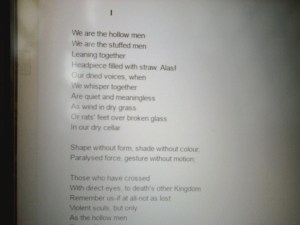
I feel like I slightly cheated on this one. Since I had to Google the poem to find out what book it was in, I just took a picture of the text of the poem as it appeared online. I was just up on the 8th floor at the piano rooms, and the volume of literature books was a bit overwhelming.

plants

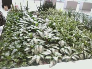
By the time I got to the end, I was exhausted. Running all over ten stories of the massive Central Library was not my idea of a good way to spend a Saturday afternoon. Good thing I wasn’t able to make it on Monday night because I really wouldn’t have had the energy for this project after a long, busy day at work. I wasn’t sure what was meant by “the most attractive environmental type” but figured I’d call this lovely installation good. The indoor garden gives the main floor a natural feel and helps naturally generate oxygen as well.

My favorite aspects of the library are the bright colors of the escalators and directories and the open, airy feel provided by all of the glass, exterior and interior. It seems like the library was mostly visited by tourists and transients, which probably accounts for why the bathrooms have such tiny doors. At least the directories had actual words and not mere pictorial icons no one could understand. There was also plenty of space between bookshelves. It didn’t feel crowded or claustrophobic, in spite of the amount of resource materials available.

What I didn’t like was how cold and hard everything was. I guess you can’t make the seats too comfortable, or they could very easily turn into sleeping quarters. The whole place had a technical feel to it, like it was all work and no play, in spite of the bright colors, with the exception of the children’s area hidden down on the first floor. I also appreciated how the main entrances were revolving doors, which helps tremendously with indoor HVAC systems controls.


Magazine Illustrations Feedback

Magazine Cover

There were a couple of constructive comments regarding our cover. One suggestion was to add a picture of The Statue of Liberty or the Empire Sate Building along with the Space Needle. I dismissed that idea because the actual prior covers containing the St. Louis Arch or the Eiffel Tower both contained a single iconic landmark. I also thought it would make the cover cluttered and/or confusing.

The other comment was about how the pennies at the bottom were a bit overpowering. I agreed with this assessment and made a correction accordingly. The gray at the top seemed too drab in contrast with the brightly shining pennies. Therefore, I made the top and bottom sections clouded and simplified. This suggestion was much more useful.

Descending

There was also a comment about the resolution of the picture we had in this illustration. It was my favorite representation I found on Google Images,though. Instead of replacing it, I decided to clean it up a bit. I removed the background from the image, shrunk it down to prevent aliasing, and spread out the illustration to make it more linear so it would merely accent the top of the front page.

Magazine Spread

The final comments were regarding the illustration Topher created. Everyone mentioned that the illustration ought to show more of Lincoln’s face, that his head ought to be centered within the outline of the United States. We both agreed, and he re-positioned the clipping mask. We also discussed the placement of the illustration within the layout and concluded that, because Lincoln is facing to the right, we would position the illustration in the bottom-left corner of the second page in our spread.

Overall, I’m exceptionally pleased with the alterations we were able to make on our magazine cover assignment due to the feedback we received from fellow students. They’re all things we might have thought to change on our own, but we also might not have noticed the same observations made by others. A little objective critique can go a long way.


The Graphic Design Process Part II

Just as 95% of oral communication is non-verbal, so too is a majority of written communication non-denotative. How a word is written is just as important, if not more so, than what is written. A word can be said with emphasis, with irony, with various mood, tone, and sensuality depending on the typography used.

typography

The message in the above photo would not communicate love and beauty very effectively if the font was plain and pragmatic. The scripting and coloring project an appreciation of aesthetic femininity.

The phrase “think outside the box” is tossed around in all aspects of the business community, expressed in myriad ways. The best way to venture beyond conventional borders is to begin with the ordinary. Play, experiment, and continues to push in different directions until you accidentally discover something inspired. Great ideas don’t appear, they develop through the process of eliminating bad ideas.

Models of architectural designs are created early in the process. Once the idea of the building is visible, the architect can see what works and what doesn’t. Every aspect must be meticulously inspected before permits are finalized and construction begins. Prototypes gives the designer a working substance to edit and refine before their product is mass-produced. Personally, I’ve received final copies of my work without having an opportunity to proof it first, and the results are mortifying. Once your product is finished, you’re fully committed, stuck with what you’ve got, no turning back. Like the old saying goes: “Measure twice, cut once,” proofing your prototype provides the chance to make last-minute adjustments and make sure you’ll be happy with what you get.

Modernism and Postmodernism

Postmodernism is Modernism on crack, learning all of the rules so all of the rules can be broken. Creativity is not a matter of coming up with a new idea out of thin air. It has been said: there are no new ideas, only old ideas with a fresh coat of paint. Creativity examines old ideas expressed by others and transforms them through constructing new associations or by viewing the idea from an alternative angle.

Form determines function. Improvisation gives multiple uses and multiple interpretations to the same reality. Form also needs to be functional, if functionality is necessary. Aesthetics are secondary to convenience and usability.

grid

Establishing a focal point, using the rule of thirds, incorporating white space, repeating design elements, forming a sense of structure and hierarchy, and creating scale, harmony, and contrast are all build on the foundation of a solid, functioning grid. Beginning with a set of pre-established parameters frees the artist to explore a myriad of opportunities within the desired framework.

irony

Visual irony: saying the opposite of what is initially perceived. Culturally acknowledged graphics, trending stylistic elements, and technologically advanced symbols can serve as non-verbal communication and lend themselves to playing with traditionally understood ideals.

Week 3 Branding Field Trip

Banana Republic

Walking into the Banana Republic was like entering a pottery shop. The walls and decor appear to be malleable clay. The sculpted, arched doorways extend from stone tiles and high quality wood floors. Wood hangers drape thick material in neutral and subdued colors. Their branding gave the appearance of catering to the ancient Greek aristocracy. The person who embodies this brand, in my opinion, is Julia Roberts. She’s calm, rich, and sophisticated. She can get away with wearing very bland, muddy colors because they offset her strong, bold features.

Ann Taylor’s The Loft

The Loft is a step down from the gods of Mt. Olympus. They still employ soft, muted colors in their decor, but the branding is geared more toward young professionals than to executive elites. Clothes are packed closer together; they are more casual and colorful. Everything is still rather expensive, high quality, and well-presented; however, it’s more likely to be worn by the assistant than the boss. A well-known actress who would represent this brand is Meryl Streep. She’s very versatile and professional; and yet, she also seems approachable, like an everyday modern woman.

The GAP

Taking casual a step further, the GAP appeals to the laid-back individual. Denim and khakis seem to be their trademark features. Their decor is personable, not elegant or classic. They do seem to still provide quality products, but products aimed more for the country girl or suburban housewife. Several people came to mind here: Jessica Biel, Meg Ryan, Ellen Degeneres. Ellen is super casual, often in jeans, even while filming her talk show. Meg and Jessica are often portrayed as “the girl next door” type in most of their movies. Therefore, the GAP seems to communicate that their clothes are what you wear when you’re not at the office.


Branding and Identity

Personally, I believe brand identities mainly exist because most people don’t have enough confidence in their own identity; therefore, they need to buy an identity from elsewhere. I’ve never been the type of person to purchase a product based solely on reputation or image. I want to try all of the options and make my own decision about where to put my money. Some brands do tend to be better in quality than other brands or generic products. Sometimes, it’s nothing but hype and status.

A prime example of brand marketing is Michael Kors. His designs are nothing special, but a handbag with his logo on it will cost ten times as much as a generic purse with no apparent improvement in quality.

A restaurant such as McCormick and Schmick’s promotes amazing quality for your money. The food is amazing. The atmosphere is relaxing. It’s a beautiful experience, well worth the expensive price tag.

A brand like Kraft is hit or miss. Their quality varies among their different products. Typically, they are a step above a generic brand. However, if there’s another option available, it’s probably going to be at least as good if not better.

The quality of Jell-O has little to do with its value; the identity of the name is everything. There is no competition.  Flavored gelatin is Jell-O; the terms are synonymous. If a company like Kraft made flavored gelatin, it would probably only sell if it was marketed as Kraft Jell-O.

Logo Sketch

Every brand identity begins with an idea.

Week 1: Industry and Type

Week One seems forever away. We spoke of the ubiquity of digital design. We viewed samples of commercial projects. We practiced logotypes and experimented with fonts on Illustrator. The images and concepts float vaguely through my mental processors. I’m eager for today’s class to firmly cement the applications of graphical expressions within my wandering inquisitions.

These images inspired me because they are all a result of creative design. The Hard Rock Cafe doesn’t simply employ a musical instrument as signage; the guitar is upside-down, which catches the eye and generates a force of subconscious tension. Illuminated or not, the sign is hard to miss.

The Snapchat ghost was on a billboard along Hwy 99 for a time. My boyfriend and I would drive past it each morning and wonder what the heck it was supposed to be. It looked like the outline of a Shrek head mask. It wasn’t until I saw the image on the backside of a Starbucks cup that I garnered enough insight to ask my teenage daughter about the image. Personally, I think a pair a small black eyes would assist the portrayal of a ghost. Whoever made a ghost costume out of a sheet without first cutting out eyeball holes?

Vogue is included here because it’s an obvious magazine cover. What struck me about this particular image is the thought process behind it. Someone was in charge of choosing font size and color as well as placement of the words in addition to which words were chosen to highlight the magazine’s content. I was impressed by all of the decision making that results in each individual cover, all of which compete for the attention of the distracted, over-stimulated hurried consumer passing the magazine counter.

What is the deal with the Starbucks logo anyway? It’s weird, simplistic, and makes no logical sense whatsoever. And yet, it’s probably the most recognizable logo in history. The headquarters building only displays a very small part of the logo without anyone questioning what company it belongs to. There are a myriad of variations ranging from sarcastic manipulations to beautiful artistic expansions, and every single one of them is discernibly connected to the original.

VW Ad

This photo is for a mock advertisement I drew. It uses a known design within the framework of a new context. No one needs to guess which type of car is presented here. The juxtaposition of black and white images is clean and clear. The alteration of positive and negative space adds interested. The bold pictures capture the viewer’s attention. It tells a story without saying a word. Graphic design is about generating emotions and connecting a message, or a brand, within the neurology of the viewer.

Questions

  1. I’m in Winter Quarter 2016, and it’s my second quarter at the Art Institute.
  2. I have an AA in Engineering Technologies, an AutoCAD Certification, and a BA in Interdisciplinary Arts and Sciences. Therefore, I’ve already had several art and drawing classes: Manual Drafting, Drawing from Life, Architectural Drafting, Watercolor Painting, and Design Fundamentals, just to name a few.
  3. My software experience is nil. I used Photoshop a little in Digital Color Theory. I loved AutoCAD until they changed the UI in 2011. I received an introduction to Illustrator earlier today.
  4. My favorite movie is Inception.